![]()
I got this book as a reference for my work with R and do like it. Just after browsing the chapters I already found some useful hints about loading and manipulating data, e.g., loading of fixed-width data files!
Posts about using R
![]()
I got this book as a reference for my work with R and do like it. Just after browsing the chapters I already found some useful hints about loading and manipulating data, e.g., loading of fixed-width data files!
Here are a few more plotting options for boxplots:
Let’s start plotting the full set
plot(b$mod, b$x)
Plot labels for a subset in full set plot (label all points x < -1)
text(subset(b$mod, b$x < -1), subset(b$x, b$x < -1), subset(b$site, b$x < -1), cex=0.6, pos=4, col="red")
Plot subset with x > -1
plot(subset(b$mod, b$x > -1), subset(b$x, b$x > -1))
Plot horizontal gridlines
grid(nx = NA, ny = NULL)
Coercing variables of character and numeric type into a single dataframe yields all vectors to be defined as factors
all <- data.frame(cbind(site, year, model, x, y, z))
The following converts selected variables from “factor” back to “numeric”
all$x <- as.numeric(x)

all$y <- as.numeric(y)

all$z <- as.numeric(z)
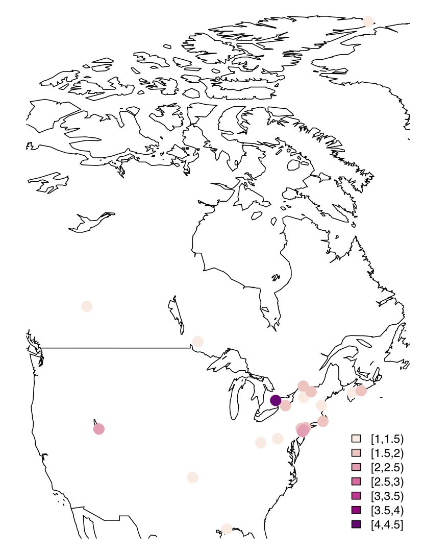
Since I look at mercury concentrations at different measurement stations in North America, visualization using a map with values (of your favourite parameter) plotted as colour-coded circles is quite useful. After some trial & error, here is some very basic code to do this –
I have adapted a recipe from the Dept. of Geography, University of Oregon
# Load packages
library(maps)

library(maptools)

library(RColorBrewer)

library(classInt)

library(gpclib)

library(mapdata)
# Define vector with the values that you would like to see plotted at desired lat/long. Your csv input file loaded as dataframe (Var) must feature the following columns (Site is optional, but useful for labeling)
Site,Para,Lat,Long
plotvar <- Var$Para
# Define number of colours to be used in plot
nclr <- 7
# Define colour palette to be used
plotclr <- brewer.pal(nclr,"RdPu")
# Define colour intervals and colour code variable for plotting
class <- classIntervals(plotvar, nclr, style = "pretty")

colcode <- findColours(class, plotclr)
# Plot the map with desired lat/long coordinates and data points with colour coding and legend
map("worldHires", xlim = c(-125, -55), ylim = c(30, 83))

points(Var$Long, Var$Lat, pch = 16, col= colcode, cex = 2)

legend("bottomright", legend = names(attr(colcode, "table")), fill = attr(colcode, "palette"), cex = 0.7, bty = "n")
And here is the result:
I use the R package zoo to plot a yearly time series of weekly averaged data. The problem is that my date variable (m.all$date) contains week numbers and these are plotted as x-Axis. What I would rather like to to is plot abbreviated months.
I can suppress the x-Axis in the plot using xaxt = "n" in the plot.zoo command, but cannot define a suitable x-Axis that plot abbreviated months instead.
I tried several variations of the axis.Date() commands without luck!
# Create zoo object for time series plot

z < - zoo(cbind(m.all$obsTPM, m.all$modTPM, m.all$refTPM), m.all$date)
names(z) <- c("Observation","Model estimate", "Model reference")
# Plot
plot.zoo(z[, 1], type = "l", lwd = 1, col = "black", screens = c(1), xlab = "Date (2005)", ylim=c(m.all$obsTPM,m.all$modTPM, m.all$refTPM), ylab = "Concentration (pg m-3)", main = "Alert TPM: Observations vs. Model Estimates, Weekly Means")
lines(z[, 2], lty = 5, lwd = 1, col = "blue")
lines(z[, 3], lty = 3, lwd = 1, col = "red")
legend("topleft", lty = c(1,5,3), legend = colnames(z), bty = "n", col = c("black","blue","red"), lwd = 1)
So I have this strange date and time string, which I would like to convert to a “useable” date, i.e., something that a spreadsheet programme or R can work with. It looks like this (MON has 3 chars):
ddMONyr:hh:mm:ss
The string is the second field in a csv file, preceded and followed by a comma.
My strategy was to terminate the string before the first colon and delete everything thereafter to be left with the following string (with one occurrence in each of the about 6000 lines of the file):
ddMONyr
sed does this in a single line (looks kinda ugly, but does the trick):
sed 's/:[0-9][0-9]:[0-9][0-9]:[0-9][0-9]//g' myfile.csv >myfile2.csv
Sed is my friend to change fixed-width text files (e.g., from an R screen output) to a comma delimited file using
sed 's/ */,/g' file1 >file2.csv
Note the two spaces between s/ and */.