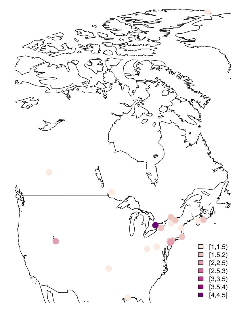
Since I look at mercury concentrations at different measurement stations in North America, visualization using a map with values (of your favourite parameter) plotted as colour-coded circles is quite useful. After some trial & error, here is some very basic code to do this –
I have adapted a recipe from the Dept. of Geography, University of Oregon
# Load packages
library(maps)

library(maptools)

library(RColorBrewer)

library(classInt)

library(gpclib)

library(mapdata)
# Define vector with the values that you would like to see plotted at desired lat/long. Your csv input file loaded as dataframe (Var) must feature the following columns (Site is optional, but useful for labeling)
Site,Para,Lat,Long
plotvar <- Var$Para
# Define number of colours to be used in plot
nclr <- 7
# Define colour palette to be used
plotclr <- brewer.pal(nclr,"RdPu")
# Define colour intervals and colour code variable for plotting
class <- classIntervals(plotvar, nclr, style = "pretty")

colcode <- findColours(class, plotclr)
# Plot the map with desired lat/long coordinates and data points with colour coding and legend
map("worldHires", xlim = c(-125, -55), ylim = c(30, 83))

points(Var$Long, Var$Lat, pch = 16, col= colcode, cex = 2)

legend("bottomright", legend = names(attr(colcode, "table")), fill = attr(colcode, "palette"), cex = 0.7, bty = "n")
And here is the result: